Contents
- 🎨 What is Harmony in Color?
- 🎯 Who Needs This Guide?
- 💡 Core Principles of Color Harmony
- ⚖️ The Color Wheel: Your Foundational Tool
- 🗜️ Practical Applications: Where to Use It
- 🚫 Common Pitfalls to Avoid
- 📈 Measuring Color Impact: Vibe Scores
- 🚀 Advanced Techniques & Future Trends
- Frequently Asked Questions
- Related Topics
Overview
Harmony in color isn't just about pretty palettes; it's the science and art of how colors interact to create pleasing and impactful visual experiences. From the ancient wisdom of color wheels to modern digital tools, understanding these relationships is crucial for designers, artists, and anyone aiming to communicate effectively through visuals. This guide breaks down the core principles, offering practical insights into creating balanced, vibrant, or subtle color schemes that resonate with their intended audience and purpose. Learn how to evoke specific emotions, guide the viewer's eye, and elevate your creative projects by mastering the fundamental laws of color harmony.
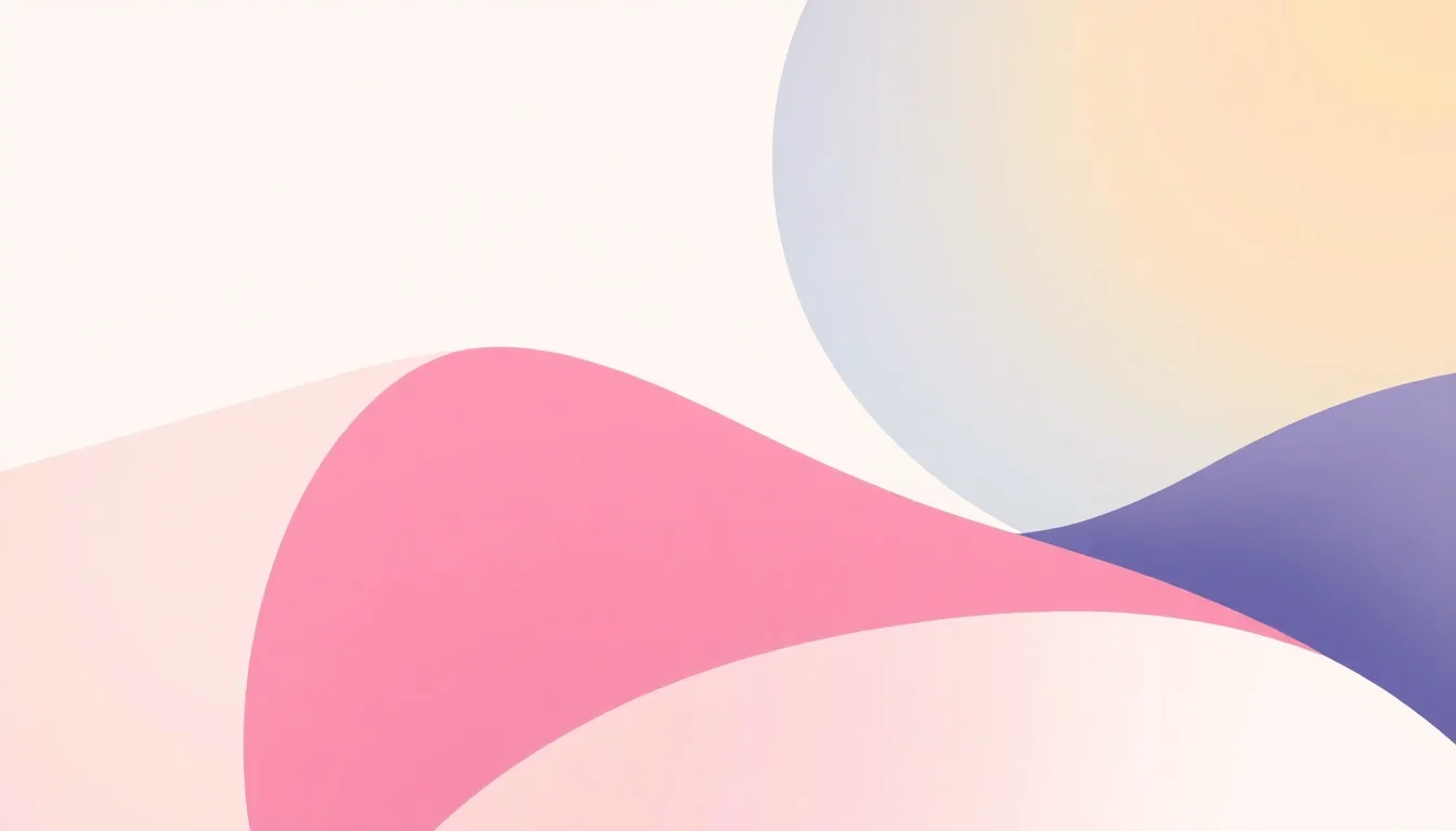
🎨 What is Harmony in Color?
Harmony in color isn't just about pretty palettes; it's the science and art of combining hues to create a sense of visual order, balance, and aesthetic pleasure. Think of it as the visual equivalent of a perfectly tuned chord in music. When colors harmonize, they evoke specific emotions, guide the viewer's eye, and communicate intended messages with clarity. This guide cuts through the abstract theory to provide actionable insights for anyone looking to master color relationships, from digital designers to interior decorators.
🎯 Who Needs This Guide?
This guide is for the pragmatist, the doer. If you're a graphic designer wrestling with brand guidelines, an interior designer aiming for a specific mood in a client's home, a web developer optimizing user experience, or even a painter seeking to elevate their canvas, this is your toolkit. It’s for anyone who understands that color isn't just decoration, but a powerful communication tool that can make or break a project's success. We're talking about tangible results, not just subjective opinions.
💡 Core Principles of Color Harmony
At its heart, color harmony relies on predictable relationships between colors, often derived from the color wheel. Key principles include complementary colors (opposite on the wheel, high contrast), analogous colors (adjacent on the wheel, low contrast and smooth transitions), and triadic colors (evenly spaced, vibrant and balanced). Understanding these foundational relationships allows for intentional design choices that evoke specific psychological responses, from calm and serene to energetic and bold.
⚖️ The Color Wheel: Your Foundational Tool
The color wheel is your indispensable map. Developed by figures like Sir Isaac Newton and later refined by artists like Johannes Itten, it organizes colors based on their relationships. Primary colors (red, yellow, blue) form the base, with secondary (green, orange, violet) and tertiary colors filling the gaps. Mastering the wheel means understanding how to create harmonious schemes like split-complementary, square, and monochromatic palettes, each offering a distinct visual effect and Vibe Score potential.
🗜️ Practical Applications: Where to Use It
The practical applications are vast. In branding, consistent color harmony builds recognition and trust. For UI/UX design, it improves usability and reduces cognitive load. In fashion, it dictates trends and personal expression. Even in marketing, the right color palette can significantly boost conversion rates. This guide provides case studies and examples to illustrate how these principles translate into real-world impact, moving beyond theory to tangible outcomes.
🚫 Common Pitfalls to Avoid
A common pitfall is relying solely on personal preference without understanding color theory, leading to jarring or ineffective combinations. Another mistake is using too many saturated colors, which can overwhelm the viewer. Overlooking the cultural context of colors is also critical; what signifies luck in one culture might mean mourning in another. We'll highlight how to avoid these traps and ensure your color choices are both aesthetically pleasing and culturally sensitive.
📈 Measuring Color Impact: Vibe Scores
While subjective, color impact can be quantified. Vibepedia's Vibe Score system offers a framework to measure the perceived energy and emotional resonance of a color combination. A high Vibe Score might indicate excitement and dynamism, while a low score suggests calmness and sophistication. Understanding how different color harmonies contribute to these scores helps designers make informed decisions aligned with project goals, moving beyond guesswork to data-informed aesthetics.
🚀 Advanced Techniques & Future Trends
Beyond the basics, explore advanced concepts like color temperature (warm vs. cool), color value (lightness vs. darkness), and color saturation (intensity). Future trends point towards AI-driven color palette generation, dynamic color systems that adapt to user interaction, and a deeper understanding of color psychology in immersive environments like virtual reality. Mastering current harmony principles is the essential first step to innovating in these emerging fields.
Key Facts
- Year
- 2024
- Origin
- Vibepedia.wiki
- Category
- Design & Aesthetics
- Type
- Topic Guide
Frequently Asked Questions
What's the difference between additive and subtractive color mixing?
Additive color mixing, used in digital displays (like screens), combines light. Red, green, and blue (RGB) are primary, and mixing them creates white. Subtractive color mixing, used in print, involves pigments. Cyan, magenta, and yellow (CMY) are primary, and mixing them absorbs light, theoretically creating black. Understanding this distinction is crucial for designers working across different media.
How do I choose colors for a brand that has a global audience?
This requires careful research into cultural color meanings. While some colors have universal associations (e.g., red for danger), others vary wildly. For instance, white signifies purity in Western cultures but mourning in some East Asian cultures. A global brand strategy often involves a core palette with regional adaptations or a focus on universally understood colors like blue for trust and reliability.
Can I use colors that aren't on the traditional color wheel for harmony?
Absolutely. The traditional color wheel is a starting point, not a rigid rulebook. Modern design often incorporates off-shades, muted tones, and neons. The principles of harmony still apply – it's about the relationship between the colors you choose, whether they're pure hues or complex tints. The goal is still visual coherence and intended emotional impact.
What is a 'Vibe Score' in relation to color harmony?
A Vibe Score is a Vibepedia metric that attempts to quantify the emotional and energetic impact of a color combination. It's derived from analyzing vast datasets of user reactions, cultural associations, and psychological studies related to color. A high score might indicate a vibrant, exciting palette, while a low score suggests calm or sophistication. It's a tool to help designers align color choices with desired project outcomes.
How does lighting affect color harmony in interior design?
Lighting is a critical, often overlooked, factor. Natural light changes throughout the day, and artificial light sources (incandescent, LED, fluorescent) have different color temperatures that can drastically alter how colors appear. A color that looks harmonious under warm incandescent light might appear jarring under cool fluorescent light. Always test your chosen palette under the intended lighting conditions.
Are there any universally 'bad' color combinations?
While 'bad' is subjective, combinations that create extreme visual fatigue or are difficult to read are generally avoided. For example, certain high-contrast combinations of saturated colors, like neon green on a bright pink background, can be overwhelming and illegible for extended viewing. The key is balance and ensuring legibility, especially for accessibility in digital design.