Contents
Overview
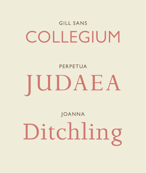
Type design is the specialized discipline focused on creating letterforms, the building blocks of written communication. It's an intricate art and science that blends aesthetic sensibility with technical precision, resulting in typefaces used across print and digital media. A typeface is not merely a collection of characters; it's a carefully constructed system where each glyph possesses distinct characteristics—stroke, counter, weight, and style—designed for both beauty and legibility. Historically, typefaces were physical metal sorts, but today they exist as digital files, manipulated by type designers using sophisticated software. The goal is to craft a typeface that is not only visually pleasing but also functionally appropriate for its intended use, distinguishing the designer's role from that of the typographer, who selects and arranges existing typefaces.
🎵 Origins & History
The genesis of type design is inextricably linked to the invention of the printing press. Early typefaces were heavily influenced by contemporary manuscript styles, aiming to mimic the calligraphic hand. Over centuries, type design evolved through the hands of master craftsmen. The 19th century saw the rise of slab serif and sans-serif typefaces, driven by industrialization and advertising needs.
⚙️ How It Works
At its core, type design involves drawing each character—letters, numbers, punctuation, and symbols—within a typeface family. Designers meticulously consider the stroke thickness, the shape of the counters (the enclosed or partially enclosed negative space within a character), the overall proportions, and the baseline alignment. Key variables manipulated include weight (light to bold), style (roman, italic, oblique), and width (condensed to extended). Variable fonts allow a single file to encompass a spectrum of weights and styles.
📊 Key Facts & Numbers
The global market for fonts and typefaces is estimated to be worth over $1 billion annually, with digital font sales accounting for the vast majority. A single high-quality typeface family can comprise dozens of individual fonts, each meticulously crafted. The development of a comprehensive typeface family can take a designer anywhere from six months to several years, with some complex projects extending over a decade. The average cost of a professional typeface license can range from $30 for a single font to several thousand dollars for an entire family, with enterprise licenses reaching significantly higher figures.
👥 Key People & Organizations
Pioneers like Jan Tschichold, whose book 'The New Typography' (1928) championed modernist principles, and Paul Renner, designer of the iconic Futura (1927), shaped 20th-century typography. Contemporary luminaries include Matthew Carter, the master behind Gallia and Verdana, and Zuzana Licko, co-founder of Emigre, who pushed boundaries in digital type. Major type foundries like Monotype, Adobe, and Google Fonts (through its Google Fonts collection) are significant players, distributing and commissioning new typefaces. Independent foundries such as TypeTogether and Process Type Foundry also contribute significantly to the diversity of available type.
🌍 Cultural Impact & Influence
Type design is foundational to visual culture, influencing everything from corporate branding to editorial design and user interfaces. The choice of typeface can profoundly affect a message's tone and readability, impacting brand perception and user engagement. Times New Roman, designed by Stanley Morison for The Times newspaper in 1932, became a de facto standard for formal documents, while the friendly curves of Comic Sans MS, designed by Vincent Connare in 1994, sparked widespread debate about its appropriateness. The digital revolution, spearheaded by companies like Apple with its early adoption of TrueType fonts, democratized access to a vast array of typefaces, making sophisticated typographic choices available to a broader audience.
⚡ Current State & Latest Developments
The current landscape of type design is marked by the proliferation of digital tools and the rise of variable fonts, which allow for a single font file to contain a range of styles and weights, offering unprecedented flexibility. Google Fonts and Adobe Fonts continue to expand their libraries, making high-quality type accessible to millions. There's a growing interest in historical revivals and the design of typefaces for non-Latin scripts, reflecting a more globalized design consciousness. The integration of type design into UX design is also a major trend, with designers focusing on legibility and accessibility across diverse devices and contexts, particularly for screen reading.
🤔 Controversies & Debates
One persistent debate revolves around the perceived 'personality' of typefaces and their appropriateness for specific contexts. Is Papyrus inherently kitsch, or is its use a matter of context? AI in font generation also presents a significant controversy, with questions about authorship, originality, and the potential devaluation of human designers' skills. Furthermore, the accessibility of typefaces for users with visual impairments remains a critical ethical consideration, sparking discussions about contrast ratios, x-heights, and character differentiation.
🔮 Future Outlook & Predictions
The future of type design is likely to be shaped by advancements in AI and machine learning, potentially automating aspects of glyph generation and font family expansion. Variable fonts will become more sophisticated, enabling dynamic typographic systems that adapt in real-time to user needs or environmental conditions. We can also anticipate a greater focus on designing typefaces for emerging technologies, such as augmented reality and immersive virtual environments, requiring new approaches to legibility and visual hierarchy. The demand for typefaces supporting a wider array of languages and cultural contexts will continue to grow, pushing designers to explore diverse calligraphic traditions and linguistic structures.
💡 Practical Applications
Typefaces are the silent communicators in countless applications. They are used in branding for companies like Nike and Coca-Cola to establish visual identity. In publishing, they are crucial for the readability of books, magazines, and newspapers, with designers often selecting specific fonts for body text and headlines. Web and app designers rely heavily on type for user interfaces, ensuring clear navigation and information delivery. Medical devices and transportation signage also utilize specialized typefaces designed for maximum legibility under demanding conditions, such as Clearview Hwy.
Key Facts
- Category
- aesthetics
- Type
- topic